I hope there will appear a trend where icons use different colors again after this particular trend blows over.
Especially in painting programs where one should be able to be really productive I don't understand why they made the icons less distinguishable in this "remove all the colors" trend.
This whole thing isn't going to blow over until we have science fiction movie special effects foldable transparent displays with completely useless user interfaces that were designed by someone who doesn't have to use them daily but is suitably impressed by them anyway. (Think The Expanse)
It was all down hill after windows 2000. Every visual cue in user interfaces such as depth, separation, colour, accelerator underlining and consistency is gone. I feel like I'm stroking a hairless, cold and thoroughly deceased cat most of the time.
I suspect, much like most aspects of the human race, that the improvement will only come after a shitty UI causes an actual body count via some ambiguity. The post-mortem for those poor souls will be a couple of paragraphs in comp.risks digest.
> A loud clatter of gunk music flooded through the Heart of Gold cabin as Zaphod searched the sub-etha radio wave bands for news of himself. The machine was rather difficult to operate. For years radios had been operated by means of pressing buttons and turning dials; then as the technology became more sophisticated the controls were made touch-sensitive--you merely had to brush the panels with your fingers; now all you had to do was wave your hand in the general direction of the components and hope. It saved a lot of muscular expenditure, of course, but meant that you had to sit infuriatingly still if you wanted to keep listening to the same program.
Another relevant Adams quip about modern interfaces from Restaurant at the End of The Universe:
> “It’s the wild colour scheme that freaks me,” said Zaphod whose love affair with this ship had lasted almost three minutes into the flight, “Every time you try to operate on of these weird black controls that are labelled in black on a black background, a little black light lights up black to let you know you’ve done it. What is this? Some kind of galactic hyperhearse?”
I'd lay the blame on Kai's power tools and their silly opaque discoverable interfaces. That's the start point of usability taking a back seat to designer bs.
I think the current trend is for generic icon sets to be monochromatic or two-tone with the idea that the system applying them will apply one or two color(s) to them based on the semantics of their use and immediate context in the app plus the apps theming, rather than that they will be presented in end products without color.
I've used these icons quite a bit. If you use the SVGs they are made in such a way that you can color them quite a bit just using CSS. I haven't used any of them in the default colors.
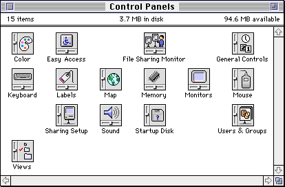
It indicates that this is a control panel. The orientation is yes, random. The rest of the icon personalizes it.
It was same for other file types: the general shape plus some personalization. Documents were taller rectangles resembling a sheet of paper with a folder corner, templates were like two sheets on top of each other, programs were squares rotated to 45 degrees, often with a hand, folders were wider rectangles with a tab, clippings were wider rectangles with a serrated edge.
Part of it may be technical. High-res, colored PNG icons a) are heavyweight, b) require you to ship multiple sizes, c) if you don't have a large enough version for a new display resolution it'll look blurry. This adds both process complexity and implementation complexity.
Vectorized icons on the other hand take up much less memory and can auto-scale to different displays and use-cases. If you take it a step further and ship them as a font - which is the gold-standard these days - they can be stored even more compactly and worked with very easily on the web and otherwise, and can even be re-colored dynamically. But of course a font can only be rendered in one color at a time.
> Vectorized icons on the other hand take up much less memory and can auto-scale to different displays and use-cases.
In the absence of grid-fitting and hinting, monochrome vector icons are just as mediocre at scaling to arbitrary sizes as colored vector icons. However, I think one "advantage" is that fuzzy monochrome borders look less bad than fuzzy outlined borders.
TTF bytecode supports grid-fitting and hinting (I believe SVG doesn't support it), and it would be interesting to see that applied to rescalable icons. However, you'd have to turn off subpixel antialiasing.
Fonts are not the gold standard. They have some advantages (mostly convenience of bundling) and some disadvantages (reliability/compatibility, and functionality). One of the disadvantages is that they’re much more likely to simply not load—fonts are supposed to be optional, and most browsers have a “don’t use the fonts the web page specifies, use my own set of fonts” setting. And the other huge disadvantage is that you’re mostly limited to monochrome icons (styleable multi-coloured text support in the one file is somewhere between non-existent and patchy, can’t remember exactly where). Overall, I’d consider one of the inline SVG variants to be the gold standard in terms of functionality and compatibility, though optimal developer ergonomics require some sort of build tool.
By "gold standard" I meant "default practice", at least in the web world. The web's most popular icon set - FontAwesome - even has "font" right in the name.
True, there are a couple of different senses in which “gold standard” has come to be used. I was treating it as “the benchmark by which all else is compared”.
But even so, I’d strongly disagree with any claim that a default practice exists for icons on the web. Images PNG, images SVG, background images PNG, background images SVG, inline SVG of a couple of varieties, icon fonts: all of these are extremely widely used, and none is in any way “standard” (let alone a reference paragon).
Funny you should mention FontAwesome. I don’t know what direction they’re taking it in, but I look at how they’ve deployed the icons on their site, and… I’m seeing a lot of inline SVG.
Don't worry. This is pretty much 80's retro-style monochrome icons that have been modernized. In 5-10 years, we'll be stuck with whatever the re-invention of 90's multi-media UI's (Kai's Power Goo etc) will result in, and we'll be looking back at this and laugh.
At least for creative programs it is better not to have any color, as this might alter color perception on your current work. But for other type of apps this might not that big of an issue.
At first I was disappointed to see that there wasn't a floppy disk for save, but upon viewing the full icon set, it's indeed still present (`save20Regular`, etc.) :
I love that the floppy disk persists as our visual metaphor for the concept of "saving". It's a wonderful remnant of a dead technology that I hope persists well into the future.
If language can behave that way ("hang up" and "dial" are popular anachronisms), then so should visual indicators. I'm always happy to see Atari Pong joysticks and SNES control pads used for video game icons.
Yes it's amusing but the floppy disk metaphor is about three technological phases out of date. It's as if a magneto crank were offered to represent "call."
I point that out to ask this: why hasn't a better, more general icon representing the concept of persisting something emerged? I've seen many attempts (various arrows with lines and whatnot,) but they don't stand alone very well. Certainly not as well as a crummy old floppy disk icon (at least for those that know what they looked like.) It's as if as soon as we began using something we couldn't detach and hold in hand we ceased being able to represent what was happening.
The main benefit here is not in how accurate the metaphor is today, but how consistently it is used. Save looked roughly the same in the 90s as it does today, across operating systems, across applications, and it's instantly recognizable. Perhaps what's a good comparison is traffic signs: no entry has very little metaphorical meaning but it's universally known and understood.
> but the floppy disk metaphor is about three technological phases out of date. It's as if a magneto crank were offered to represent "call."
The phone icon used everywhere depicts a corded type (without the cord) that was last popular in the 90s. After that there was a wireless version, then flip-phones, then smartphones.
So actually about the same number of iterations out of date.
> why hasn't a better, more general icon representing the concept of persisting something emerged?
Icons are good at representing objects but terrible at representing behavior over time unless it's simple directional movement. How would you symbolize something like the concept of persistence? "Data that can be retrieved unchanged in the future"? A pen, a clock with progression arrows on the hands, and reading glasses? Surely not if there's already an established convention available. The floppy disk happens to be that convention, as the last object that was unambiguously connected to local storage (an optical disk would be ambiguous for recorded music consumption, HDD were supposed to be invisible to the regular user and USB sticks could just as well be any of a variety of radio interfaces in the same form factor). So floppy disk it is. And it's not a problem at all that the convention, once established, is now used by generations that have never seen a floppy, it's just visual language to them. Complaining about the lack of connect between that language and the life realities of it's users seems to me as pointless as complaining that the word dog does not sound like barking at all (why not whoofwhoof?) or that the word hammer does not sound like the noise of hammering (why not banger?).
And still, the floppy disk icon is in decline, because applications that eschew local storage tend to use the "arrow up to cloud" icon. Another convention that has absolutely nothing to do with what is actually going on (few datacenters are actually hidden in clouds)
Iconography can work outside the context in which it arose when it is sufficiently ubiquitous and new users learn it as an abstract shape instead of a nmemonic for the physical world.
I think that the 3.5 diskette will have staying power since the trend in applications is to constantly persist. The icons needed have shifted to SCM-like commit, branch, fork, diff, merge, revert. However, these are conceptually very abstract compared to "Save."
Yes, I know. I'm not arguing that it is unworkable or a detriment to the function of some system.
Again, why did we stop with disks? Right or wrong that's what happened. Why?
There were punch cards and tapes and other stuff before disks. There have been flash devices and cloud services and other stuff since. Yet, for some possibly interesting reason we got stuck on disks, and floppy disks in particular.
3.5" disks is what most people had on their work and home computers since early 1990s if not late 1980s. 5.25" floppy disks became rare after, say, 1995. I suppose nobody had punched tape on their home or office computers, it was in the realm of programmers and operators.
The disks are mechanical devices, so their shape is dictated by function and thus was uniform. E.g. USB flash drives do not have such consistency.
What the endgame of symbols look like is easy to see in Chinese / Japanese. E.g. "save" 保 consists of a man, a mouth, and a tree. It's about as easy to make sense of as a combination of a square with a cut corner and a rectangle inside it.
> What the endgame of symbols look like is easy to see in Chinese / Japanese. E.g. "save" 保 consists of a man, a mouth, and a tree. It's about as easy to make sense of as a combination of a square with a cut corner and a rectangle inside it.
Interesting example. It's worth pointing out here that most characters are not composed entirely of meaning-indicating components; there is e.g. a whole series of compounds of 青 which use it solely to indicate the pronunciation of the compound, not to claim that invitations (请) are somehow metaphysically green (青).
But 保 is an exception! Going by wiktionary, it originates as a compound of 人 and 子, both used for the meaning -- protecting is what people do with babies. (Interestingly, the character 仔 exists independently today.) Evolution of the component on the right into 呆 was purely based on shape, and transformed the original meaningful component into something completely arbitrary -- there was no point at which 口 and 木 (as separate from 呆) were conceptually part of the character.
This is wonderfully apt then! The 2.5" diskette is all envelope and protective curtain, completely concealing the actual disk. (Unlike CD / DVD which are emphatically disk-shaped.)
Thank you for bringing up “口”. I was trying to find a reference of Apple using that as inspiration for the iPhone home button. Maybe the story is apocryphal?
I haven't heard of this. It doesn't make a ton of sense to me; 口 is an obsolete word for "mouth" which survives as part of other words like 人口 "population" or 出口 "exit [noun]" in the senses of "mouth" or "entrance; opening". (Compare "the mouth of a cave".)
My theory would start with shape distinctiveness. While some of the Microsoft iconography uses a vertical rectangle for phone (in the context of adding apps), the blob-ended wide U of the old fashioned telephone handset is still the predominate icon for a telephone. The follow on technologies were much simpler in form and thus make for shapes that are indistinguishable from any other box. An icon needs a high level of distinctiveness to be successful.
Likewise, the follow on technologies to small portable storage did not have distinctive and ubiquitous shapes. Maybe a long rectangle with a short end against a square would represent a flash drive? I think that a sibling comment about the 3.5” diskette being present at the birth of GUIs must be part of the answer too since the world didn’t immediately transition to flash drives and other media. All lived together for quite a while.
Looking at “floppy icon” search results leads me to believe that many icon designers have never seen an actual 3.5” diskette. On many the shutter is too wide and could not slide open, on others the rotor mating surface is classic iPod low.
Floppies were what everyone used to store things at the same time that GUIs were coming into wide adoption, so the first save icons were floppies. And then they never updated the icon. Floppies were a thing from like 1970-2000. That's 30 years! No wonder the icon is still around.
The 3.5" floppy disk is easy to draw and recognize. Today we save documents on mechanical drives, SSDs, USB devices, cloud... As a way to represent the "save" action, the only alternative to floppy is an arrow and a square, or an arrow and a cloud. It's imprecise and vague. The floppy disk is still a strong metaphor.
It's kind of the same reason people will call something a "tape" when they mean a "audio/video recording". Or they "wire" you money. Or that welfare is paid with "food stamps" (it actually comes on a card now).
Certain legacy methods and technologies just carry on in the vernacular because it's easier to make analogies to them long after they become obsolete.
You made me curious about the origin of wiring money. Turns out, it was named after bank transfers carried over telegraph wire. I think it is safe to assume that wire transfers are still carried over wires. So it is actually not anachronistic at all, but is technically correct (the _only_ kind of correct).
Same thing. Went digging for the save icon - interesting that the continuous save feature drops the floppy icon. I think as we move to more cloud hosted documents and stuff we'll see floppy drop out for some looped paper kind of thing. I hope the visual language of a floppy sticks around forever
What the heck is wrong with color? With nicer icons? We finally have really really nice screens and displays and a bunch of designers have made unilateral decisions to replace the joy and beauty of a well designed UI with utter, boring conformity and lack of imagination
Google recently changed all their app's icons to just letters, with a similar (identical?) coloring. Now instead of my email app looking like a clearly defined message icon, it's "M". Thanks Google
I partially agree, but it's also about versatility. Icons should be recognisable is a multitude of sizes and themes. The problem is that simpler icons have a steeper learning curve. Less tech savy people can't possible understand what many, or even most icons are supposed to mean. The app im typing this right now has a sort of paper plane icon on top. When did paper planes become "send"? My parents would certainly miss that metaphor.
It's the same learning burden as any other icon for most people, but with the advantage that it actually means "send". (Though not in an online messaging context; that's 发.)
There aren't enough of those. We're already well past the point where icons are completely inscrutable, even in applications intended solely for a monolingual user base.
This approach does not involve forcing the entire world to learn Chinese. It involves a bunch of written vocabulary words.
It exactly mirrors the old approach of using English words, except that it fits into the narrower space given to icons. And it is vastly superior to using icons, for the same reason that using English words is.
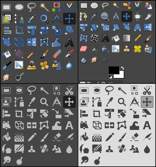
The new Gimp icons are fine for experienced users (like myself) who only need a faint pointer to the function if the tool. I use shortcuts for most of them anyway.
But users who are only starting to learn the ropes the classic big and colorful icons are a serious help. They are still available, just not made the default.
I use GIMP enough that I would call myself experienced, but I don't generally identify icons by shapes, I'm used to identifying almost all icons by color.
The half-red half-blue thing was the eraser. The yellow thing with a black dot was the clone stamp. The yellow stick was a pencil, the brown stick was a paintbrush, the red stick was an airbrush, the dark grey stick was the magic wand selector, the black bomb was the burn tool, and the white 45-degree square was the fill tool. The black A was the text tool, the blue A was the measure tool.
I'm reasonably experienced with GIMP and I find them useless. It's seriously difficult to quickly pick out the icon I'm looking for even if I know what it looks like. Even months (years?) after they changed the icons I was still finding myself spending seconds or literally tens of seconds sometimes trying to find the right icon.
Anyway I realised you can change them back and now finding things is almost instant again. Eraser? -> Look for pink -> done.
Because marketers have to justify their own jobs, and doing so involves promoting change for the sake of change. Frankly I'm amazed they're still breathing oxygen and not methane, having an oxidizing metabolism is so 90s.
Those aren’t exactly app icons though. They’re more like buttons, and I actually like buttons having a uniform look. It helps consistency and declutters interfaces.
The argument for restricting the use of color/animation/sound in UI elements is that you don’t want to have the icons distract from the content.
The problem with that is that, sometimes, the user is looking for UI elements. I don’t see us build an AI that detects that and makes icons more colorful/distinctive (and don’t even know whether that would be a good idea), so I guess the ideal is somewhere in-between: icons that are neither too bland nor too colorful.
This justification makes no sense to me. Icons aren't window dressing, they serve an actual functional purpose (identifying things that you can click on to perform actions). Removing color and making them all look similar makes them worse at their intended functional purpose.
So many pixels are wasted on the goofy super magnified trends of today. I really wish we weren't so wasteful of screen space, most of the time.
I'm not saying that we should all aim for maximum information per pixel or anything, just that we not be wasteful like what I've seen recently. It's maddening.
If you have colorful icons you'll need to duplicate the resources to account for light and dark variants unless you prefer sub-optimal legibility. If you emphasize color as a method of representing state you'll need to adjust by shipping images for each state value. With monochrome icons the emphasis is placed on shape so you can efficiently render the whole icon in a different color without obfuscating its meaning.
I agree with some other commenters that these are very pared-back icons, but I don't see that as a bad thing - they might not be quite right to use as-is for many projects, but they're a great starting point that a design system could use to build out from.
If the starting point has too much personality, it becomes very hard to integrate with existing designs and risks making everything using this icon set look like everything else using this icon set.
I think a lot of people are missing a major point: they specify mobile and macOS. Monochrome UI icons are the norm on those platforms and they're trying to conform to the designs of those systems. Fluent UI is meant to be cross-platform so that your UI looks like it "belongs" regardless of platform. They're not making some kind of UX/UI design statement or illustrate some philosophy with this repo specifically (although Fluent UI as a whole could be argued as such), they're just providing a freely available set of icons that may make sense for your particular project, like Font Awesome.
Not if you want your UI to look the same across platforms, but still look like it "fits" in wherever. One is free to use SF symbols specifically on Apple devices if they want, or if they want it to look the same on Android, Apple devices, web, etc. they can use these icons (or some other icon library).
There's room for both "stock" icons and alternatives.
Unpopular opinion I guess, but I think they look great. At work we maintain a Fluent UI based Outlook Add-in and I gotta say, I now much prefer it over say Material UI.
Agreed. They are much 'cuter' and approachable than the recent geometric icons used by MS. Still a ways to go (especially with the smileys), but I like their direction.
Do people really manage to do anything useful with these icon sets, or do you end up having to craft your own to mimic these? I find that I can do the generic add/zoom in/copy/settings/blah and then when I need buttons for "Show wiring" and "Set milking schedule" or "View restaurants" then it's tricky to use an icon, but too time consuming to try to create a new one. The usual antipattern is "OK I'll use this lightning one as a placeholder to mean do-thing, and I'll create a better one later". That never happens, so you have these monochrome overly generic icons around.
The pendulum has swung full opposite from the skewmorphic trend in the early 2000s. Now it's all about abstract shapes for UI buttons, and abstract color blobs for app icons.
I for one, like monochrome icons, this allows me to add color based on context and theme. So the icons now also take primary, default and warning color as defined in the theme.
I like these. They remind me of the bitmap icons on the original Macintosh, designed by Susan Kare. It's astounding how much fun and whimsy manages to come through on a 16x16 or a 32x32 B&W grid.
I wish Microsoft actually used such icons on their websites, instead of screwed up fonts that don't work on Linux. I have to add microsoft fonts to my linux and it still doesn't work, as some languages don't have all those characters...
So things like outlook.com or onedrive.com look like garbage and you can't really use the menus like a normal person.
They're good for marketing and a manager because there's a number of nice adjectives about them. "modern", "minimalistic" etc. They're bad for users - because they all look the same and lack color as well as shading.
I feel like things have consistently gotten worse from a UI perspective since Windows2000. Every aspect of the interface including the icons are harder to understand. It's hard to describe, but them seem to lack context.
I get what the point is (i think). Symbols like we see that indicate male vs female gendered bathrooms, the 'Handicap parking' and others allow everybody (and i hope all/most cultures) to instantly recognize what is being depicted. I would be hard pressed to guess what half of these are trying to represent.
> Symbols like we see that indicate male vs female gendered bathrooms
That we recognize a gendered stick figure on a door to mean "this is a toilet" is not less arbitrary than the "WC" signs you see in Europe, which at least have some meaning ("water closet", olde timey for "toilet")
What does colour or shading have to do with an icon?
Does it being colourful or having shadows impact the representation?
I don't think colour or shading has any impact on the icon. I think proper accessibility by labelling said icon is 100% more important then anything else, unless it's a universally understood symbol (such as floppy disc for saving).
When I'm quickly trying to find a bookmark, it's easier for me to find the ones with distinctive colors. I've actually rearranged my bookmarks toolbar at times just to get better separation between similarly-colored favicons. So IME there is a singificant advantage to having memorable colors to the icons; they're easier to find.
I may be in the minority, but I prefer the monochrome icons. I've always found the old set distracting. That might be due to my mix of SPD symptoms and ADHD.
I definitely think it should be an option though for people that find the colored icons easier to find when searching.
Especially in painting programs where one should be able to be really productive I don't understand why they made the icons less distinguishable in this "remove all the colors" trend.