I don't know about others but I stare at my screen to avoid eye contact with strangers. It's not like I don't want to, it's that a part of me thinks that it is rude to be looking at others if you don't know them. Don't know from where it got instilled into my mind.
London is famous for the lack of any interaction on public transport. Before phones, the most organized people would read books or newspapers they'd purchased. Less organized people would read the free newspaper, look idly at the advertising, or stare out of the window — even in a tunnel.
I really wanted to switch to this but unfortunately it doesn't have support for Xwayland scaling :( in case youre using 4k, On Wayland only KDE and Gnome seem to have gotten this working.
If you're on KDE check out Karousel. It's a KDE Kwin script that does this type of scrollable tiling right inside KDE. Works great on my ultrawide monitor.
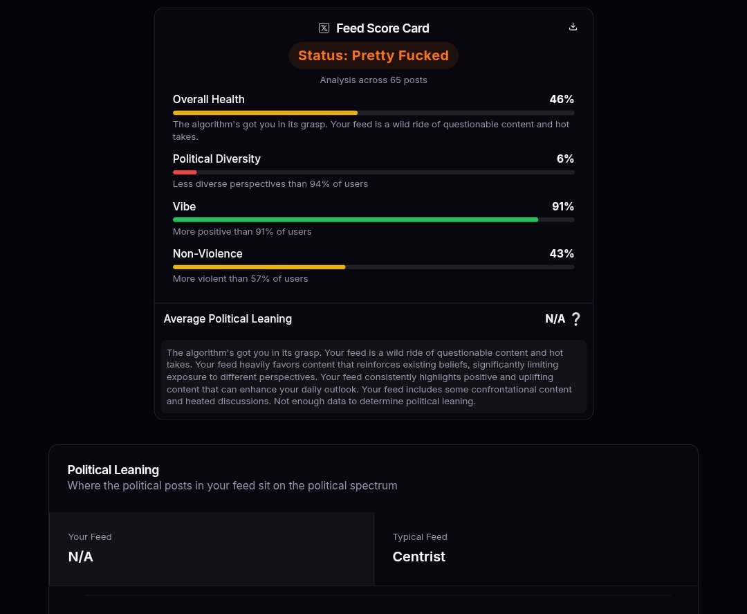
It says that my feed is pretty fucked, but I only follow pixel and anime artists :) I unfollow anyone that posts anything other than art repeatedly, I guess it is an echo chamber of some sorts.
In my experience only NVENC is supported by most video recording tools, and if you are on AMD, it's using the CPU, thus slowing everything to a crawl.
AMD should be using VA-API but it's not a very good system as it fails or breaks if you look at it the wrong way. I use a tool to stream my desktop to my TV (sunshine) which uses it, and every month VA-API fails with a new error so it has to resort to CPU encoding.
Why are there so many "Update Reamde.md" pull requests ? They all are named exactly the same, and most of the time add a single line to the readme with the name of the commit author. I guess some git tutorial somewhere shows how to open a PR with this repo as an example, and people actually do it.
I feel like my prayers have been answered, was looking for a good pixel font for the web and this seems like what I need! It's also monospaced so I can use it for programming
Unless you want to impose blurry fonts onto your visitors, this font won't be it unfortunately. The required increments of 11px to display a crisp font with DepartureMono makes your content either too small (11px) for most people to read, or too large (22px) to look good.
I am always saddened by landing pages like this, because they communicate an idea that only works in very specific cases. Are you looking to use this font for a similarly polished, "Apple"-style landing page that is form-over-function? Then this font clearly is for you. But on 99% of pages that have actual content on them this font likely won't work, as much as I, too, would like for it to.
> Display scaling (integer or fractional) will make X11 apps look blurry; this needs to be supported in xwayland-satellite.